Ecommerce Product Page Checklist: Before You Publish
Review product details, images, variants, pricing, delivery, accessibility, and SEO with a practical ecommerce product page checklist before publishing.
Original editorial diagram for this guide; not product inventory or a company photograph.
A product page has to help a shopper decide whether an item is right for them and what will happen if they order it. That requires more than an appealing headline and an add-to-cart button.
A useful ecommerce product page checklist follows the buyer’s questions: What is it? What do I receive? Which option should I choose? What does it cost? When might it arrive? What happens if something goes wrong?
Use these checks before publishing and when product details or terms change. Custom merchandise needs particular clarity about personalization and approval.
1. Make the product immediately identifiable
Write a specific, readable product name that describes the item and its meaningful distinction. “Personalized Cotton Tote with Front Print” provides more context than an invented collection name alone.
Keep the main heading, first image, and opening description aligned. A visitor should not have to scroll to determine whether the listing sells a finished item, a downloadable file, a sample, or a design service.
State what is included. If the photograph shows props, multiple items, or optional packaging, explain which parts belong to the purchase. For bundles, list the contents rather than relying on the photograph to do that work.
Quick check
Ask an unfamiliar reader what they would receive. If their answer differs from the offer, revise the top section.
2. Explain the choices before requesting a decision
Sizes, colors, quantities, print locations, and personalization fields should use familiar labels. Put the information needed to choose close to the relevant control.
For clothing, link to measurements that apply to the actual product. For personalization, explain character limits, capitalization, available placements, and whether a proof is part of the process. Do not promise a proof if the workflow does not include one.
Indicate when a selection changes the price or production requirements. Avoid presenting an unavailable combination as if it can be ordered.
W3C’s form-labeling guidance explains that controls need labels describing their purpose and an appropriate association in the page code. A visually attractive selector still needs to be understandable to people using assistive technology.
3. Use images that answer different questions
Start with a clear main view, then cover relevant angles, material detail, scale, and meaningful variations. Identify mockups and concept images when their nature affects a buyer’s understanding.
Verify that the displayed imagery matches the selected option. A photo of one print treatment should not silently stand in for a different treatment with different visual characteristics.
Write concise, contextual alternative text for informative images. Keep dimensions, care instructions, and essential conditions in readable page text as well. An infographic can support the explanation, but it should not become the only source of order-critical information.
4. Separate facts from promotional language
The description should explain materials, dimensions, construction, intended use, and relevant limitations. Replace broad words such as “premium” with specific facts that have been verified for the item.
A hypothetical notebook listing could describe its actual page count, cover material, binding, and print position. It should not invent paper certifications or durability claims to sound more persuasive.
Group specifications under descriptive subheadings. Use consistent units and check that diagrams agree with the written measurements.
Only include care instructions that apply to the actual product and decoration method. When information is unconfirmed, resolve it before presenting it as a fact.
5. Make price and timing understandable
Show the price for the selected configuration and explain material conditions such as minimum quantities. Make it clear whether an amount is a per-item price, a starting price, or a total for a set.
Disclose how shipping, taxes, setup charges, or optional extras are handled in the actual ordering process. Do not imply that the displayed amount is the complete checkout total if additional charges can apply.
Distinguish production time from transit time. For custom work, explain whether production starts after payment, artwork approval, or another confirmed step. Avoid a universal delivery promise when the destination or final design can change the timing.
Place a concise summary near the buying decision, with links to fuller current policies when needed.
6. Address problems without hiding conditions
Make contact details, cancellation information, and the return or issue-reporting process easy to find. Summarize important distinctions for personalized goods accurately and link to the applicable policy.
Do not copy a generic return promise that conflicts with how the business actually operates. Have the appropriate person review terms for the markets where the store sells; a product-page checklist cannot establish legal compliance.
If customer reviews appear, use genuine submissions and represent them accurately. Do not create review text, star ratings, endorsements, or urgency claims to fill an empty section.
7. Give search engines accurate page information
Use a descriptive page title and a concise meta description that match the content. Write for the person deciding whether the result is relevant, rather than repeating variations of the same phrase.
Use a consistent, understandable address following the ecommerce URL guidance. Plan redirects and updated internal links before changing an existing URL.
Google’s product structured-data documentation distinguishes markup for purchasable products from product snippets and explains how product information can support richer search appearances. Use the appropriate type, keep it consistent with the visible page, and validate it. Structured data does not guarantee a particular search appearance or ranking.
Do not add review ratings or stock claims to markup unless they are genuine and applicable to the page.
8. Test the complete buying path
Review the actual page, not only the design mockup. Use a phone and a larger screen, and test keyboard navigation through the important controls.
Check that variant changes, quantity controls, personalization fields, required-field errors, and cart behavior work together. Verify that the cart preserves the chosen configuration and any approved customization information.
Inspect the page while images load. Large images should not make the buying controls difficult to reach or cause confusing layout movement. Check broken links, missing images, and text that becomes difficult to read at smaller sizes.
Use an appropriate test or preview checkout process so the review does not accidentally create a real paid order.
A practical release decision
Classify findings into three groups:
Stop release: incorrect product facts, misleading images, broken ordering controls, or missing material purchase conditions.
Fix before promotion: unclear explanations, missing useful detail views, or confusing mobile layout.
Improve after observation: optional content or presentation experiments that do not prevent an informed purchase.
Assign an owner to unresolved issues. After release, use customer questions and verified behavior to decide what to improve. Do not interpret a small amount of activity as proof that one wording change caused a sales result.
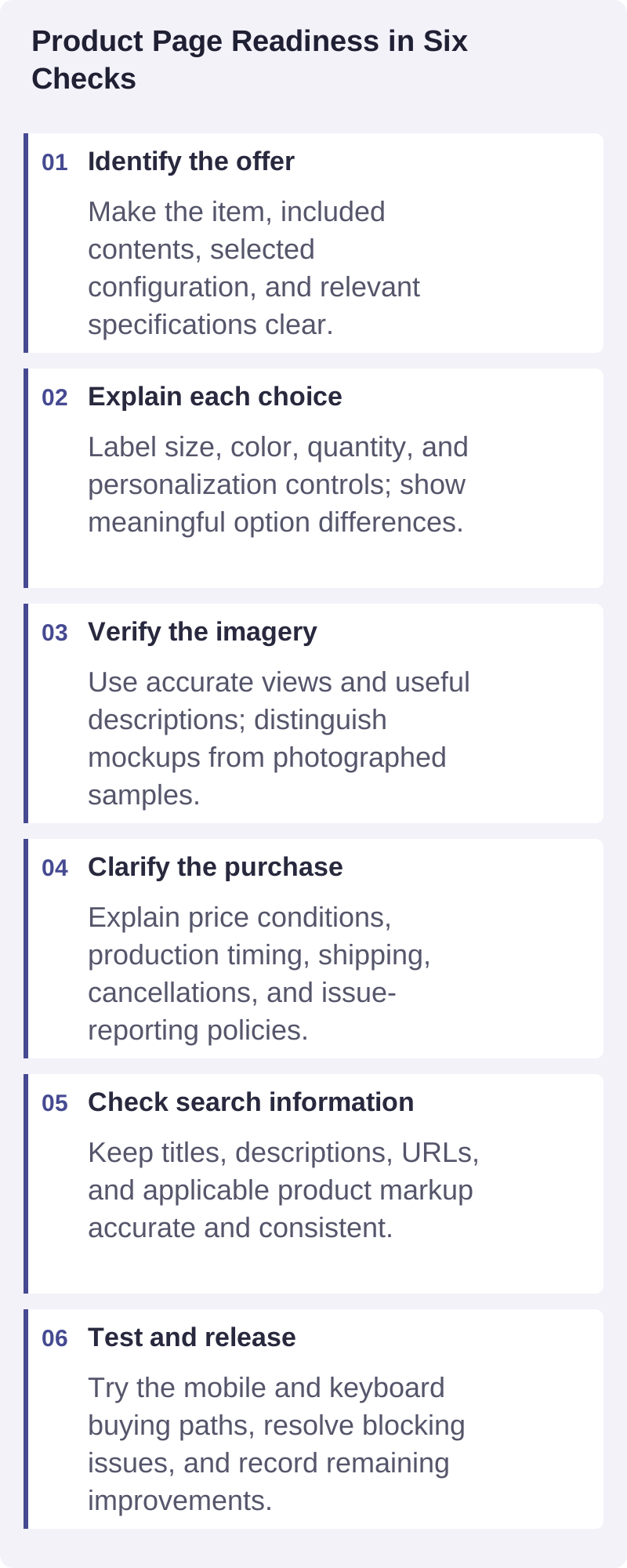
A practical visual summary of the decisions discussed in this guide.
Frequently asked questions
How long should a product description be?
Long enough to answer the relevant purchase questions without repeating itself. Simple products may need a short description and specifications. Personalized or technically complex products usually need more explanation, organized into scannable sections.
Does every product need its own page?
Use a structure that makes meaningful choices understandable. Closely related options can belong together, while substantially different products may need separate pages. Avoid creating near-duplicate pages solely to target slight keyword variations.
Can SEO fixes replace missing product information?
No. Metadata and structured data cannot tell a customer what the page itself fails to explain. Confirm the offer, imagery, choices, pricing conditions, and ordering process before treating technical optimization as the finishing step.
Review one page before scaling
Choose an important product, complete the checklist, and resolve the highest-consequence gaps first. Contact Brilliantor to discuss your ecommerce presentation project and the product information, design assets, and ordering requirements it needs.