
Brilliantor Editorial · October 17, 2026 · 4 min read
Typography on Small Merchandise: Make the Message Readable at Size
Plan readable typography for small merchandise with a clear message hierarchy, actual-size reviews and product-specific checks before final artwork approval.
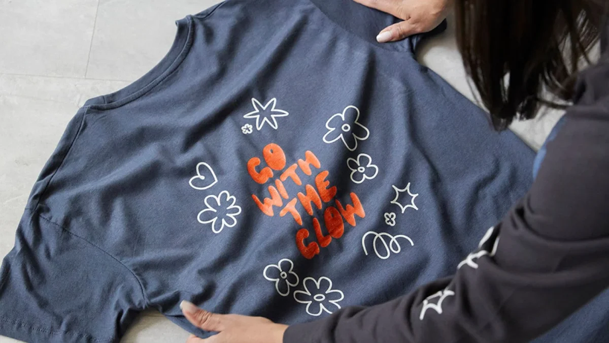
A phrase can look elegant on a large artboard and become difficult to read when it reaches a sticker or a small area of a mug. The answer is not always a bigger font. Sometimes the layout needs fewer words, a different hierarchy or a typeface with clearer letter shapes.
Start by deciding what the recipient must notice first. A merchandise design is a physical composition with limited space, not a document that someone can keep enlarging on screen.
Quick takeaways
- Choose one primary message before adding supporting text.
- Review the design at its intended physical size.
- Test letter shapes, spacing and contrast together.
- Confirm the selected production method’s guidance rather than assuming a universal minimum.
Give each line a job
Separate the content into essential, useful and optional wording. A collection name may be essential; a long slogan, date and website might compete with it. Try removing optional wording before compressing all the lines into a smaller block.
For a fictional community event, “River Weekend” could be the main message and the year the supporting detail. If the full schedule cannot fit clearly, put it in the accompanying communication instead. This is an editorial decision, not a license to omit required information. Confirm any mandatory wording with the project owner before simplifying it.
Compare actual letter shapes
Two fonts at the same nominal size can look quite different. Compare the height and openness of the letters that appear in the real wording. Check whether a lowercase l, uppercase I and numeral 1 are distinguishable when those characters matter. Review punctuation and small internal spaces, not only the overall silhouette.
Adobe’s text tools documentation explains options for placing text as individual points, within areas or along paths. Select the layout approach that serves the composition. Curving a sentence is not automatically a solution when the sentence is simply too long.
Print an actual-size review sheet
Place the candidate artwork at its intended physical dimensions on a plain review sheet. Confirm that the sheet prints without an unintended fit-to-page scale change. Examine it at a plausible reading distance and ask another person to read the exact words without being told what they say.
This checks composition, not the final behavior of ink, fabric, coating or texture. A paper review cannot prove how a fine stroke will reproduce on the selected surface. Record what remains uncertain and assess a physical product sample where the decision warrants one. Use our sampling checklist to keep that review organized.
Match the layout to the selected product
A flat kiss-cut sticker gives a different viewing situation from a curved ceramic mug. For the mug, consider which part of the message is visible from a normal viewing angle. Do not assume a long line across a wrap can be read all at once.
Use the exact product template and confirm restrictions for text, fine lines and placement. A guideline for one print process is not a universal rule for every product. Keep important words clear of handles, openings or edge zones as applicable to that specific template, rather than borrowing a generic clearance measurement.
Check the final file for silent changes
A substituted font can change line breaks and spacing even when the wording stays correct. Adobe’s missing-font guidance explains that desktop applications can flag unavailable fonts. Resolve that state deliberately before approving the layout.
Compare the exported file with the approved artwork, including capitalization, punctuation, line breaks and character shapes. Keep an editable text master. If a delivery workflow requests outlined type, make a separate delivery copy after proofreading and confirming the font’s permitted use. An outline is a delivery choice, not a substitute for checking the words.
Frequently asked questions
What is the smallest safe font size?
There is no single size guaranteed across typefaces, artwork, surfaces and processes. Obtain product-specific guidance and review the actual design at size.
Should every word use the same typeface?
It can, but consistency alone will not create hierarchy. Weight, spacing, line breaks and the amount of content also affect the composition.
Bring the real wording to the quote
“This is the exact message, this is the product and this is how it should be read” gives a designer a concrete problem to solve. Request a quote with the wording and intended placement so the review can address the physical use rather than a large-screen impression.