The best decoration method is the one that suits your garment, artwork and intended use. DTG, DTF and embroidery can each produce appealing custom apparel, but they solve different problems. Choosing by a single label such as “premium,” “durable” or “cheapest” hides the decisions that matter.
Start with this shortlist: investigate DTG for detailed printed artwork on compatible garments, DTF when a transfer process suits the material and placement, and embroidery when a stitched, dimensional finish is part of the design. Then test that choice against the exact product.
What each method actually does
DTG: ink printed directly onto the garment
Direct-to-garment printing places ink onto the garment itself. The workflow may include pretreatment and a curing stage. White ink on dark fabric introduces different preparation needs from printing on a light garment. The official DTG process overview shows these stages.
For buyers, the important questions are material compatibility, print appearance and feel. Cotton and cotton-rich options are common starting points, but do not assume DTG is universally limited to them. Supported fabrics depend on the printer, ink, pretreatment and production workflow.
DTF: artwork transferred from film
Direct-to-film printing produces the design on film, uses an adhesive system and transfers it to a garment with heat. The film is removed according to the process requirements. This creates a different construction from ink applied directly to fabric.
Compatibility still needs checking. An official fabric-compatibility example distinguishes DTG treatment for selected blends from a film-transfer workflow for polyester. That is a system-specific example, not permission to apply every transfer to every textile.
Embroidery: a design built with stitches
Embroidery uses thread to create the design. Artwork must be converted into stitch information, a process called digitizing. Changing a file extension does not do this job. The official explanation of embroidery digitizing describes the conversion from artwork into an embroidery design.
The stitched result has texture and depth. It also needs to be considered as a physical object: stitch density, backing and placement affect how it feels and how the fabric hangs.
Decision one: what does the artwork need?
Look at the design at its intended production size, not enlarged on a monitor.
Photographs and complex illustrations: Begin by discussing a print method. Ask how subtle shading, fine texture and light areas will reproduce on the garment color. A simplified illustration may translate to embroidery, but it will become a different visual treatment.
A compact, clearly drawn logo: All three methods may deserve consideration. Compare the appearance you want: printed detail, a transfer finish or visible thread. The logo’s smallest letters and narrowest gaps may determine whether simplification is needed.
A large solid block: Compare the feel of an actual decorated sample. Coverage can be more important than the name of the process. Ask whether the layout could use open areas without changing its meaning.
Small text: Request a legibility review. There is no single reliable minimum size that applies to every font, fabric and method. Thin serifs, tightly spaced letters and tiny enclosed shapes deserve particular attention.
Decision two: can the garment support it?
A decoration that works on a stable sweatshirt may behave differently on a lightweight stretch shirt. Check the exact fabric composition, surface, color and any coating. Seams, pockets, zippers and curved areas can limit usable placement.
For embroidery, lightweight or stretchy materials need careful stabilization. Dense designs can distort fabric or feel uncomfortable, and the reverse side should be inspected as well as the front. This technical guidance on embroidering performance fabrics explains why design density and backing require attention.
For heat-applied decoration, ask whether the garment tolerates the required application conditions. For printing, ask whether the selected color needs an underbase and what that means for the result. Do not approve a garment substitution without reassessing compatibility.
Decision three: how should it feel during wear?
Describe the desired wearing experience in plain language. “A lightweight shirt for a long outdoor event” is more useful than “best print quality.” It tells the production team to consider coverage, flexibility and feel alongside sharpness.
Touch the decorated area and then try the garment on. Bend your arms, sit down and notice where the design folds. For embroidery, check whether backing or stitching is noticeable against the skin. For printed designs, assess the actual artwork size rather than a small sample patch.
No method name guarantees comfort. Two designs made by the same method can feel different because their size, coverage and construction differ.
Decision four: what does the full quote include?
Compare like with like. A quote for a small chest logo should not be compared directly with one for a full front design. Record the same garment, quantity, decoration dimensions and placements for every option.
Ask whether the quoted scope includes:
Artwork preparation or embroidery digitizing.
The number of decorated positions.
Individual names, numbers or other variations.
Sample production and revisions, if requested.
Packaging, delivery charges and applicable taxes.
Charges or file requirements for repeat orders.
There is no universal quantity at which one method becomes cheaper than another. Production setup, artwork coverage, stitch count, garment handling and the actual order all affect the comparison. Request a project-specific quote rather than relying on a generic online price hierarchy.
Use a sample to resolve the important risks
A digital mockup is useful for approving wording, approximate placement and overall proportions. It does not demonstrate texture, exact color or laundering performance.
For a physical sample, agree what you are testing. Use the intended garment and artwork where practical. Review color, edge definition, legibility, placement and comfort. Follow the supplied care instructions, then inspect the sample again. If repeat consistency is important, retain the approved sample and the associated specifications.
An approval should identify the version. “Looks good” is less useful than approval tied to the garment color, decoration size, location and final artwork file.
Decoration-method checklist
Confirm the exact garment and fiber composition.
View the artwork at production size.
Flag tiny text, fine lines and large solid areas.
Compare the desired texture and wearing comfort.
Review a consistent, itemized quote.
Resolve sample issues before approving production.
Keep the final artwork, placement and care instructions together.
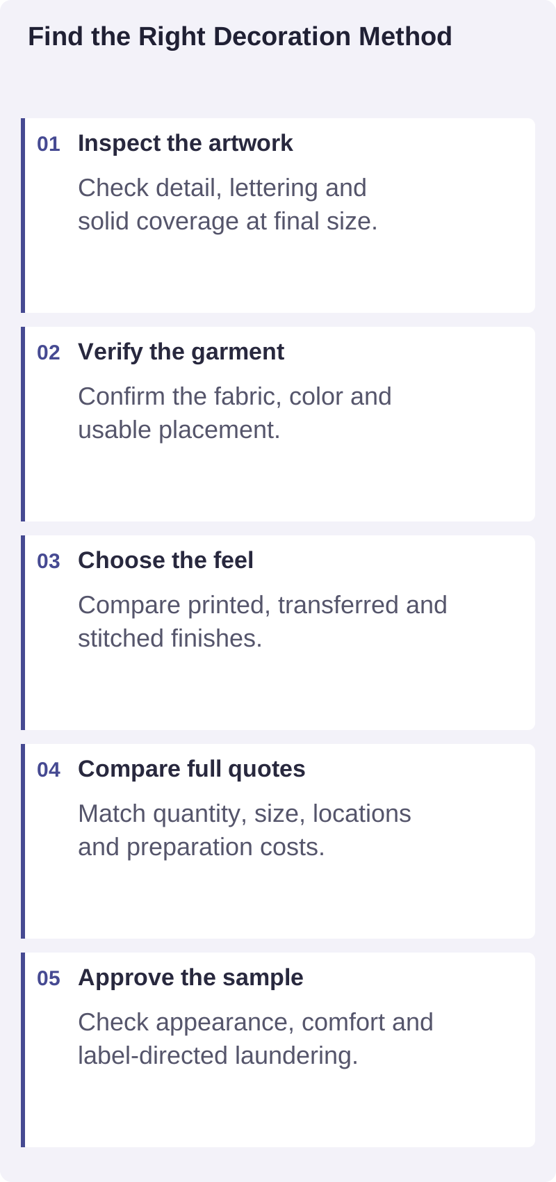
A practical visual summary of the decisions discussed in this guide.
Frequently asked questions
Which lasts longer: DTG, DTF or embroidery?
There is no dependable universal winner. Materials, preparation, application, stitch construction, wear and laundering all matter. Ask for evidence relevant to the proposed finished product rather than an unsupported number of washes.
Can the same logo be used for all three methods?
Usually the same brand identity can guide all three, but the production artwork may need changes. Small lettering, gradients and fine detail can require different treatment, especially when converted into stitches.
Is embroidery always the most professional-looking option?
No. A stitched logo may suit a uniform, while detailed printed artwork may suit creative merchandise better. Professional appearance comes from a considered match between design, garment and use.
Choose around the project
Share your artwork, intended garment, quantity and priorities through Brilliantor’s contact page. Ask for a method recommendation based on those details, with any compatibility or sample questions made clear before you commit.