
Brilliantor Editorial · October 17, 2026 · 3 min read
Posters vs Stretched Canvas: Choose a Surface for Your Space
Compare paper posters and stretched canvas by surface, mounting, artwork and display conditions. Plan wall art without assuming every format fits every room.
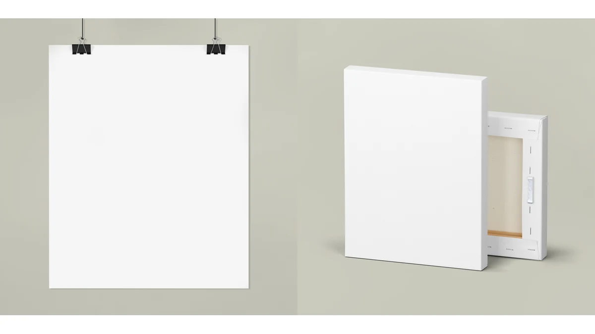
A wall-art choice starts with the room, the image and the way the work will be installed. A paper poster can offer flexibility in presentation. Stretched canvas introduces depth and a textile surface. Neither option is automatically more professional; the better choice supports the intended artwork and display.
Begin with an actual wall measurement and a description of the viewing distance. A small image above a desk solves a different layout problem from a wide piece seen across a reception area. Use those facts to narrow the format before comparing finishes.
Compare the surface before choosing the size
The rolled-poster model lists fine-art, matte and semi-gloss paper preferences. Its page describes fine-art paper as textured and semi-gloss as satin-like. Confirm the selected finish and paper weight with the quote rather than assuming every route uses the same stock.
The 1.25-inch stretched canvas uses a cotton/polyester composite over a pine frame. That material difference gives you a specific comparison to review: paper surface versus canvas texture, rather than a vague better-versus-worse claim.
Ask to see important details at the intended printed size. Thin lines, small captions inside artwork and subtle gradients deserve attention. A sample is useful when texture may change the way those details are read.
Plan the visible edges and mounting
Decide whether the work will be framed, displayed as a sheet, or presented with visible depth. For canvas, confirm what appears around the wrapped edges and where important artwork must stay clear. Do not assume a front-facing preview explains every edge treatment.
The listed stretched-canvas model includes rear hanging hardware, but that is not a guarantee that the supplied hardware suits every wall. Confirm the finished weight, mounting approach and any building restrictions with the person responsible for installation. Do not add an unverified load rating to the brief.
For paper, ask who supplies the frame, backing and glazing. A poster order and a complete framed display are different scopes. Write that distinction into the enquiry so the visual expectation matches the delivered object.
Treat display light as a real constraint
The Library of Congress explains that light damage is cumulative and that sunlight can be especially difficult to control for light-sensitive material. Its conservation guidance is not a lifespan certification for a particular catalog print. Use the principle to ask sensible questions about placement and exposure.
Look at the wall at different times of day. If strong direct light reaches the position, discuss an alternative location and the selected material’s guidance. Avoid promising a fixed fade-free lifetime unless the exact product and evidence support it.
Check dimensions and destination together
A format listed in a size selector is an enquiry preference, not proof that every route delivers it everywhere. The canvas product page includes specific destination restrictions for some oversized formats. The matte vertical poster also has a destination limitation that should be checked before planning a project around it.
Keep wall dimensions, artwork orientation, preferred surface, mounting scope and destination in the same brief. If a preferred route cannot support that combination, reconsider the format before final artwork approval.
A short decision sequence
Choose the location, compare the actual surfaces, review the composition at size, confirm mounting responsibilities, then approve the quoted format. That sequence makes wall art a considered display decision rather than a guess based on a small screen thumbnail.