
Brilliantor · October 18, 2026 · 4 min read
Embroidery Artwork: Simplify Designs Before Digitizing
Simplify embroidery artwork at the intended size, compare detail and spacing, and prepare a useful digitizing brief before approving a sample.
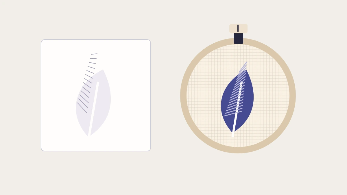
The fine lines that make a drawing elegant can disappear when the same design becomes a small embroidered mark. Start by deciding which shapes carry recognition, then simplify around them at the intended physical size.
Treat the artwork file, the digitized stitch file and a physical sample as different stages. This guide offers a design-review process; exact limits must come from the production method, fabric, placement and digitizing requirements for your order.
Choose the detail that carries recognition
List the two or three features that make the mark identifiable. For a botanical badge, that might be the outer leaf shape, the stem and one internal vein. A textured illustration may contain dozens of smaller marks that add little at the final size.
Create a simplified copy beside the original. Keep the master artwork intact. Remove details deliberately, then compare the two at the intended physical dimensions. The question is whether the essential idea survives, not whether every drawn line remains.
If the mark only works when highly enlarged, consider a different placement, a larger decoration area or a different method. The DTG, DTF and embroidery comparison helps frame that choice.
Inspect shape, spacing and lettering separately
Review filled areas first. Look for tiny enclosed spaces, isolated specks and abrupt changes in thickness. Then inspect the spaces between shapes. Simplifying two objects without preserving their separation can turn them into one visual mass.
For lettering, examine counters, punctuation and spacing at size. A readable word in a digital preview may become crowded when translated into thread. Do not apply a universal minimum text size across all fonts and materials; ask for the relevant production requirements.
| Artwork feature | Useful question for the digitizer |
|---|---|
| Fine internal line | Should it be removed, widened or represented differently? |
| Small enclosed gap | Will it remain distinguishable on the selected fabric? |
| Gradient or texture | Can a simpler color treatment communicate the idea? |
| Thin script | Is a different type style or larger placement needed? |
| Small detached detail | Can it be integrated into a stronger silhouette? |
Decide how colors will function
Give each color a purpose: separate an object, create contrast or preserve a key brand relationship. Do not add shades simply to mimic every transition in a screen image.
Ask how thread options will be selected and approved. A digital color reference helps describe intent, but it is not proof of an exact thread match under every light. Review the actual options available for the order.
For a hypothetical leaf badge, a two-color treatment may communicate the form more clearly than several similar greens. That is a design option to test, not a guarantee that fewer colors always produce a better result.
Compare three versions instead of guessing
For a hypothetical leaf badge, save three candidates beside the original:
- Detailed: the full outline and all internal veins.
- Reduced: the same outline with one main vein and wider separation.
- Silhouette: the outer leaf shape alone.
Print or display each at the proposed physical dimensions and compare them against the garment color. Decide which one still communicates the intended idea without relying on zoom. This screens the artwork; it does not simulate the finished stitches.
Send the strongest candidate and the original to the digitizer. Explain which detail you would prefer to keep and which you are willing to remove. Ask them to flag any spacing, stitch or material concerns before preparing the final production file. Keep their revised artwork connected to the proof so the buyer approves the design that will actually be used.
Brief the digitizing stage clearly
Provide the simplified artwork, intended dimensions, product material, placement and the visual details you consider essential. Ask the production team to flag changes needed before treating the file as ready.
Do not assume an ordinary vector export is already a stitch file. Ask which artwork formats are accepted and who prepares and approves the digitized result. Record any design changes so the customer sees the revised appearance.
Evaluate a sample at normal viewing distance
Inspect the shape, legibility, gaps and fabric behavior on the intended or appropriately representative material. Look closely, then step back to the distance at which the product will normally be seen. Both views matter.
Record the approved dimensions, artwork revision, thread choices and sample outcome. If you change the material or scale later, reassess rather than automatically reusing the approval. For small lettering decisions, continue with typography on small merchandise.
The strongest embroidery brief gives production a clear visual priority and leaves space for a method-specific assessment before release.