
Brilliantor Editorial · October 17, 2026 · 3 min read
Product Image Alt Text: Describe the Information That Matters
Write useful alt text for product and editorial images without keyword stuffing. Distinguish informative, decorative and linked images in a practical review.
Useful alt text helps someone understand the information an image contributes when they cannot see it. It is not a hidden sales headline or a place to repeat every keyword on the page. Start by asking what would be missing if this particular image were unavailable.
The answer changes with context. A product photograph, a decorative background and an image used as the only content of a link do different jobs. One description should not be copied into all three situations without review.
Identify the image’s job first
The W3C’s Images Tutorial distinguishes informative, decorative and functional images. Informative images need a text alternative conveying essential information; purely decorative images can use an empty alternative. An image that functions as a link or button needs its purpose communicated.
Use those distinctions as the starting point for an editorial review. Do not decide that every attractive image is decorative. If the image shows a product feature the surrounding copy does not explain, it contributes information that needs another route to the reader.
Describe what is visible without inventing specifications
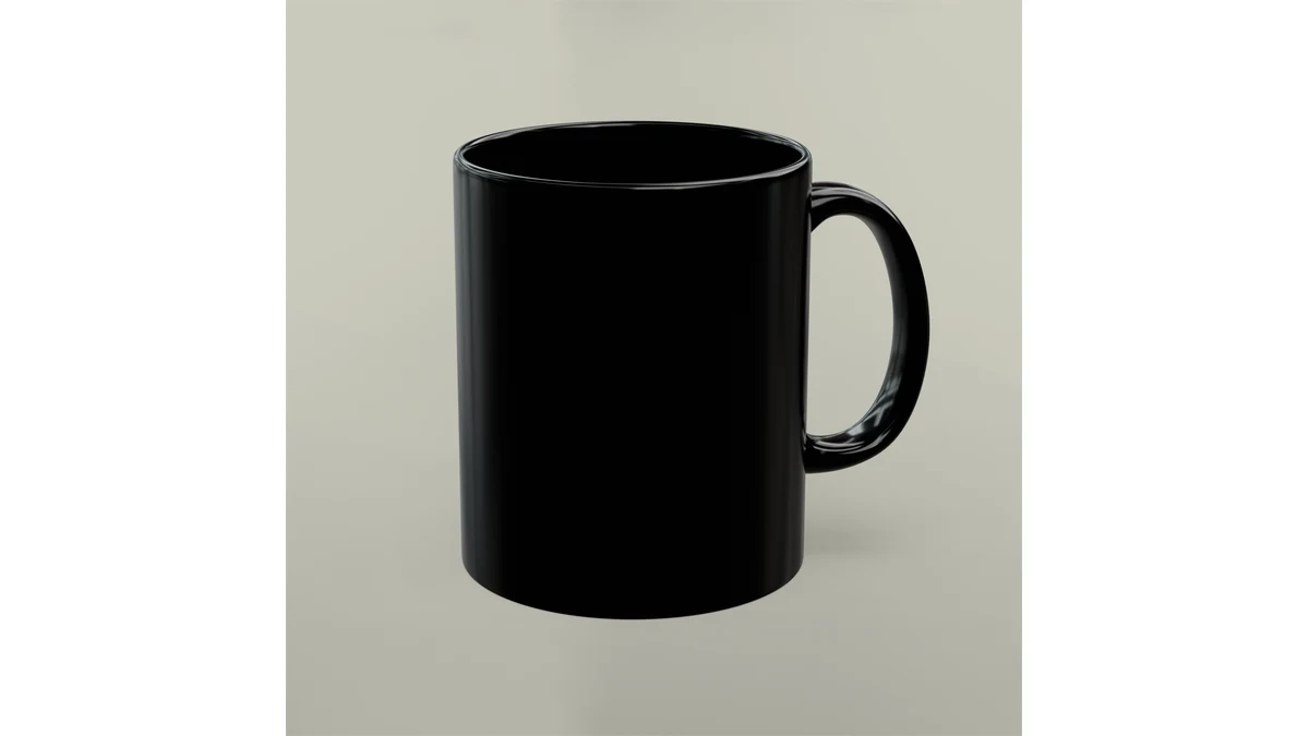
For a black ceramic mug, a useful short description might identify the black mug, glossy appearance and handle view when those are visible and relevant. It should not invent a capacity that cannot be established from that image alone, promise dishwasher performance or claim that a staged photograph shows an exact available variant.
Keep factual specifications in the product copy and use verified model information where needed. Alt text does not have to become a second product page. A plain, accurate sentence usually serves the reader better than a string of commercial phrases.
Explain why another view exists
A second image should contribute something: a reverse surface, a close-up or a different angle. If a gallery has two genuinely different views of the ceramic mug, describe the meaningful difference rather than labeling both “best custom mug.”
Review the gallery controls too. A button that changes the visible view needs a usable name, and its selected state should be understandable. Writing alt text alone does not verify the accessibility of the whole gallery.
Keep source images distinct from product evidence
This article’s cover shows the black mug used in the example above. Its alternative describes the visible glossy surface and handle view. It does not claim a capacity, a confirmed variant or a working accessibility feature. Review the source and image description together whenever a cover changes.
For a real tote photograph, describe the actual pictured item. Do not use a generated conceptual illustration as evidence of its shape or construction. Source accuracy and accessible description support each other.
Review the image in its page context
Read the heading, nearby text, image alternative and any link name in sequence. Remove unnecessary repetition, but keep information that would otherwise disappear. If a graphic contains complex instructions, provide those instructions in ordinary page text rather than relying on a very long alternative alone.
A practical editing pass asks four questions: Is the image informative here? What does it add? Is the description accurate? Can the page still be used when the image is unavailable? These questions are more useful than forcing every alternative to a fixed character count.
Keep the review repeatable
Record the image’s purpose alongside its file and page location. Revisit the alternative when the image changes. For broader presentation checks, use the product-page checklist and keep accessibility part of the publishing workflow, not a keyword exercise at the end.